Parallel Kitcheners

The redoubtable Trevor Haldenby mentioned the existence of this document to me at TEDx Waterloo the other day, and it was too good not to track down.

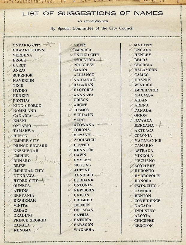
Created by city council in 1916, it’s a list of “Parallel Kitcheners”: suggested names for Berlin, Ontario, during the period before it changed its name to Kitchener. Originally settled by a largely German immigrant population, Kitchener was known as the Town of Berlin from 1854-1912 and the City of Berlin from 1912-1916. As WWI approached and anti-German sentiment rose, other Canadians began to express growing doubts about whether or not the people of the very Germanic-sounding Berlin, Ontario were doing everything they could to support the Canadian war effort … hence the name change.

Looking at the list now, I wish I lived in Mechano, Hydropolis or Industria. I may well have to begin the process of transforming Kitchener into one of them at a speed that keeps my activities slightly below the conscious level of its citizens.

(from the John A. Lang fonds of Library and Archives Canada).

Goodbye To All That: The Death of Bookstores

“Poetry laments the loss of physical space not only for book stores, but for actual physical space: it is not ready for virtual.”
— Sina Queyras

The last year of the first decade of the 21st century will be remembered as the year the bookstores died in Canada.

Today is December 29th, 2009. In Winnipeg, McNally Robinson Booksellers has just filed for bankruptcy protection, and is about to close its Polo Park location and its brand New Don Mills (Toronto) store. In August 2008, they closed their Calgary location. That leaves one location in Winnipeg and another in Saskatoon. If the bankruptcy protection application is approved, they’ll survive, along with a web store.

Eight days ago, the CBC reported that the Toronto Women’s Bookstore is also in jeopardy. Founded in 1973, the store does not have the money to pay its January bills, and is seeking help with fundraising to sustain it for the next year. Since 2004, women’s bookstores in Calgary, Saskatoon, Hamilton, London and Sudbury have all closed. According to the Toronto Women’s Bookstore, there are only 21 women’s bookstores left in the entire world.

These two events add insult to the injury of a very bad year for book retail. In Toronto in particular, 2009 was a bookstore bloodbath. Marc Glassman’s venerable Pages Books & Magazines closed its doors after 30 years. Atticus Books, a vast cave crammed full of used scholarly and art books, declined to renew its lease and went Internet-only. In February, David Mirvish Books went dark.

This is not to say that there are no independent booksellers left. In Toronto alone, there’s the Book City chain, This Ain’t the Rosedale Library (safely ensconced in its new Kensington Market digs), Type Books and Ben McNally Books for starters. But it’s worth noting that the cultural landscape of Canadian cities is changing for the worse.

The roots of this situation have to do with more than the rapid growth of digital media. The incursion of big-box book retail at the beginning of the decade, which was initially received as a boomtime blessing, had a lot to do with it. Small publishers experienced unprecedented sales as their books were used to fill the shelves of cavernous stores scattered across the Power Centres of the nation. After several years of people were so besotted with big-box bookstores that some were seriously arguing that they might soon replace the function of public libraries. Libraries, moreover, traditionally do not have a Starbucks in the building.

All of the sales that small publishers were making to the big-box chains quickly turned into an avalanche of returns. Profits from the initial sales, used to print larger runs for subsequent seasons of books, were clawed back by Chapters and Indigo as credit for returns — credit which they then used to finance new shipments of books for which the publishers could suddenly no longer afford to pay their printers. As long as the bookstores were in expansion mode, their investors were satisfied, but as soon as the stores actually had to make money, thpue whole system collapsed into a frantic shell game, complete with thinly disguised government bailouts for the publishers.

What happened next would have seemed surprising to someone who didn’t know that Chapters had lost complete control of their inventory system at least once and probably twice. At the behest of managers frantic to reduce store inventory levels, employees packed skids of books according to publisher alone and sent semitrailers full of them back to the distributors. The smaller but wilier Indigo reared up and swallowed a weakened Chapters like a python eats a pig.

Over the middle years of the decade, Indigo’s purchasing agents scaled back drastically on orders of small-press titles, concentrating instead on larger orders of books that they could sell like picture frames, scented candles and translucent plastic household widgets from Umbra. (Oprah’s Book Club and even Canada Reads have much to answer for in this respect: the homogenization of international reading tastes may result in the sales of larger quantities of books, but what makes a good bookstore is variety, not quantity.)

The result is a national chain with a near-monopoly on book sales where, despite the size of the actual retail space, the variety of actual books on sale is dismally limited, and not just in terms of small-press literary titles. Last month, I couldn’t find a single Raymond Chandler book in the Mystery section of a Kitchener IndigApters store. I’ve said this before and I’ll say it again: we get the culture we deserve.

On the Internet, there are more independent writers than ever. There are places that digital writing can be had freely, both legally and illegally. But I find it depressing to note that the consolidation of books into the hands of one or two large gatekeepers has occurred in digital space even more rapidly than it occurred in physical space.

So the Internet is both poison and cure for this moment in the history of print culture. Not all independent booksellers will vanish, any more than all books will themselves totally sublimate into digital data. But public space will be different forever. Since I was a child, I have habitually learned the space of new cities by the locations of their bookstores. What I know about the culture of a place I have learned at least in part from what I found inside those stores. Those markers are fewer and farther between now, and we’ll be needing a new set of waypoints.

Originally published as “Alienated 15: Goodbye to All That,” Matrix, December 2009.

Feature image by Shira Golding.

theanyspacewhatever: Field Notes

On the way to theanyspacewhatever, the Guggenheim Relational Aesthetics show, I meet mariachis on the subway between 77th and 86th.

Maurizio Cattelan’s “Daddy Daddy” — drowned yet floating (because wooden? Then how’d he drown?) Pinocchio — makes it all worthwhile immediately. Father of 4-year-old girl turns it into an object lesson about the importance of lifejackets.

The Guggenheim is a lot of things, but it is pretty clearly not anyspacewhatever. Whatever.

Rirkrit Tiravanjia, “Chew the Fat.” Sitting here watching TV on the museum’s temporarily carpeted floor, watching TV. My shoes are around the corner, under a bench. Would be even better if they weren’t there when I went back for them.

Shoes are still there. Oh well.

Giant press-on text on every surface and hanging signs mostly banal. Should have hired a poet.

Dominique Gonzalez-Foerster, “Promenade.” Sound environment. Only part of the gallery where people walk slowly. Sound is of a downpour in a forest somewhere. It’s pretty, but the best part is the people wearing audioguides are completely oblivious to it.

Jorge Pardo, “Sculpture Ink.” Cardboard dividers with holes jigsawed out, amphibian-shaped lights. The works of a giant mechanical wristwatch. Slows down the passage. Of time.

Douglas Gordon and Rirkrit Tiravanjia, “Bar.” Barista with 3 espresso machines pulling coffees for people sitting on beanbag chairs, watching movies previously banned in the US. Audience mesmerised by Tod Browning’s Freaks. Gabba Gabba Hey.

Carsten Holler’s “Revolving Hotel Room” looks like Christian should be living in it. Gentle sway of clotheshangers the only visible indication of its slow rotations.

Angela Bulloch, “pixel boxes” and “Night Sky.” Kids, yelling, love the boxes: “That’s so cool. We’re in outer space.”

The guards, who are utterly oblivious of people, me included, talking on cell phones and snapping photos throughout the gallery, point out this sign to me right when I try to take a picture of the hygrometer at the end of the ramp. I always liked the hygrometers best.

(Flickr set here.)

Our Own Devices: Art Through Camera Screens

As the song says, I like New York in June. New York City in August, though, is hotter and stickier than an elephant’s ass. For this precise reason, a substantial bulk of the people who can be found in Manhattan during the late summer – tourists and locals alike — retreat to the vast air-conditioned interior spaces of the city: movie theatres, retail outlets and art galleries.

This year, I was one of those people. I spent a week drifting across the city from gallery to gallery, pausing only for brief hydration breaks and the occasional slice from Ray’s. Call it the Iron Man of 21st century flânerie. The relatively empty streets made it feel like a week of Sundays, or possibly a shot from the Will Smith version of I Am Legend during one of the scenes when the vampire cannibal people are all dormant (I’m beginning to think about that film as a documentary of sorts).

One of the insights I’ve had over the years, and this is hardly an original observation, is that one of the most interesting things to do while in New York is to watch the people themselves. While part of the masses stomping through the icy caverns of the MOMA in August, though, it was hardly optional, as there were invariably people between me and what I thought I was there to see – the art. Readjusting my perspective to focus on the people, though, got me thinking.

MOMA policy differs from that of many of the other New York art galleries in an important respect: it allows (or at least tolerates) photography of the vast majority of the gallery’s permanent collection. The only “No photography allowed” sign I saw on this trip was in front of the James Ensor show, which was not on permanent display. While most museums still try to instil an air of almost religious, respectfully silent contemplation into their visitors – an attitude that explicitly excludes the taking of pictures, via the use of low-light conditions and grumpy people in polyester blazers stationed throughout the space – something else was happening in the MOMA. Nearly everyone in the gallery was busily snapping pictures of the art with a bewildering array of consumer photographic technology.

Some people concentrated on photographing the art itself, while others had friends and lovers pose beside it (throwing gang signs optional). I saw more than one person crooking their neck awkwardly to hold their audio guide handset between their ear and shoulder while they simultaneously attempted to snap an image of the subject of the handset’s discourse.

Walter Benjamin observed in the third version of his famous essay on “The Work of Art in the Age of Its technological Reproducibility” that while architecture and film are designed to be viewed simultaneously by large groups, painting isn’t. Up until the 18th century, the reception of painting took place largely in churches, monasteries and royal courts, where access to them was both graduated by space and mediated by class. Benjamin argues that modern attempts present paintings to the public have met with mixed success, because they are stripped of many of the earlier means of organizing and mediating the experience of viewing them. “[T]he same public which reacts progressively to a slapstick comedy, ” he writes, “inevitably displays a backward attitude toward Surrealism” {{1}}.

Does this still hold true in the context of the MOMA today? Benjamin was writing at a time when Surrealism and the other avant-gardes were attempting to produce a revolution in everyday life. Surrealist objects like Duchamp’s Readymades were an attempt to call the entire economy of precious works of art and art galleries into question. Today, these objects are ironically among the most venerated and valuable objects in museums and galleries worldwide. People flock to the MOMA to take pictures that duplicate the pictures of objects that they’ve already seen, whether on the Web, in coffee table art books, or on posters on a dorm room wall.

This need to experience a work of art as already mediated might well be the true face of Nicholas Bourriaud’s relational aesthetics, which argues that much contemporary art leans toward the participatory {{2}}: in order to experience a work of art today, perhaps we have to see it through our camera screens. Especially when it’s right in front of us.

In a passage that anticipates pretty much everything Marshall McLuhan would write some 40 years later, Benjamin covers this possibility as well: “The medium through which works of art continue to influence later ages is always different from the one in which they influence their own age.” For Benjamin, this later impact is constantly in flux, and fainter than it was initially. What interests me, though, is the notion that artists might only be able to produce the response that they desire from the public by when their work is approached “in an indirect manner” {{3}}. Simultaneously thinking about art as both an object in front of you and an image on the screen might be just such an indirect approach.

The point, as Slavoj Zizek argues in The Parallax View, is not to privilege one perspective over the other, breathlessly endorsing the digital or grumbling about how no one appreciates culture any more, but to think about the irreducible difference between the two {{4}}: we can’t have one without the other. The differences between a work of art hanging in a gallery and the print and digital images of it which are usually our first experience of it can be shocking – and instructive. When it’s on the wall in front of you, Dali’s “The Persistence of Memory” is REALLY SMALL. Monet’s “Water Lilies,” on the other hand, are on canvases so overwhelmingly huge that sitting in front of them feels like entering a 19th century panorama, the precursor of a digital virtual world. In Mondrian’s most geometric paintings, you can still see traces of human effort in the brush strokes, and the thickness of the paint varies across the canvas. A digital image on a camera or cell phone is no less material, but its materiality is different: 2 megapixels or ten? Colour, black and white, or sepia? Consigned to live forever on a hard drive or immediately uploaded to a blog, Facebook, Flickr or Picasa where it will be seen, commented on and recirculated by hundreds, thousands, or millions?

So what happens when we try to think about these possibilities simultaneously? We end up reconsidering our whole idea about what constitutes an art “object” at all. In 2000, Marjorie Perloff coined the term”differential media” to describe Kenneth Goldsmith’s Fidget, which is not so much an object as it is a network. Fidget is, variously, a musical score, several professionally tailored paper suits, a web-based Java application, a pair of large visual poems on paper and a performance piece as well as a book; no one node in the network takes priority. What Perloff argues is that such works indicate that “knowledge is now available through different channels and by different means” {{5}}. Which was, perhaps, the point of the Surrealist Readymades all along.

Originally published as “Alienated 14: Our Own Devices,” in Matrix 84, fall 2009: 50-51.

Featured image by Stacy Lynn Baum.

[[1]]http://www.marxists.org/reference/subject/philosophy/works/ge/benjamin.htm[[1]]
[[2]]http://docs.google.com/gview?a=v&q=cache:fol7u3wIPzcJ:www.creativityandcognition.com/blogs/legart/wp-content/uploads/2006/07/Borriaud.pdf+relational+aesthetics&hl=en&gl=ca[[2]]
[[3]]Benjamin, Walter. “The medium through which works of art continue to influence later ages.” Walter Benjamin: Selected Writings. Volume 1, 1913-1926. Ed. Marcus Bullock and Michael W. Jennings. Cambridge/London: The Belknap Press of Harvard University Press, 1996. 235.[[3]]
[[4]]Žižek, Slavoj. The Parallax View. Cambridge/London, MIT Press, 2006. 19.[[4]]
[[5]]Originally published in the back of Goldsmith’s _Fidget_ (Toronto: Coach House Books, 2000), this notion has been expanded into a longer essay, that appears in several places, including here: Perloff, Marjorie. “Screening the Page/ Paging the Screen: Digital Poetics and the Differential Text.” http://marjorieperloff.com/articles/digital-poetics-and-the-differential-text/[[5]]

Say What Again: Avant-Garde As Software (video)

Gertrude Stein once observed that the first time someone makes something, it’s ugly and no one likes it. The second time someone makes the same thing, it’s pretty and everyone can like it. I’ve often taken Stein’s aphorism as a commentary about how the forms of the 20th-century avant-gardes, which were once so far outside of the mainstream of culture, have become smoothly functioning components of the vast digital machines that we use to sell things to each other.

In 2007, Jarratt Moody, then a student at the Savannah College of Art & Design, made “Say What Again” for a class on time based-typography taught by Professor Duff Yong. For a long time, it circulated around various video sites under the title “intonation.mov,” which I actually like better than “Say What Again,” because it sums up the nature of the entire clip without referring explicitly to its content.

Whatever you call it, this clip is the epitome of the phenomena that Lev Manovich describes in his essay “Avant-Garde As Software” namely, that software “codifies and naturalizes” the techniques of early twentieth-century innovators in Italian and Russian Futurism, Merz, Dada and the other avant-gardes.

“Say What Again'”s evocation of mayhem through letters in motion positions it as a direct descendant of Filippo Tomasso Marinetti‘s “parole in liberta” (words in freedom). What Marinetti was after was a form of literature that accurately conveyed the enthusiasm of the day for emerging forms of electrical and mechanical technology. In his 1912, “Technical Manifesto of Futurist Literature,” Marinetti writes: “One must destroy syntax and scatter one’s nouns at random” and “one should deliberately confound the object with the image that it evokes” accomplishing this goal by varying tones to avoid a “tedious unity” – using symbols instead of letters, employing a multitude of typefaces and sizes, non-rectilinear layout and so on.

In “Geometric and Mechanical Splendor and the numerical Sensibility,” he writes that, “The words-in-freedom, in this continuous effort to express with the greatest force and profundity, naturally transform themselves into self-illustrations, by means of free, expressive orthography and typography.” Nearly a hundred years before “Say What Again,” the sensibility that could have produced it was already in place.

The avant-gardes, of course, made films of their own, some of them typographic. Marcel Duchamp‘s “Anemic Cinema,” wildly innovative in a time of wild innovation, is an analog ancestor of dynamic typography. Given the technological limits of the day, most of the films of the avant-garde were quite short, so there’s a certain formal similarity between them and many of the clips on the Internet, which tend to be brief in order to minimize the limitations of streaming media. But the similarities go beyond duration to describe a particular kind of cultural moment.

Like the typography of Italian Futurism, “Say What Again” emphasizes the dynamism and violence of the culture that produced it through the placement and size of typographic elements. What’s more, the choice of particular typefaces also conveys meaning because of the previous uses of that face as well as its general shape and outline. Linotype Mistral, now inseparable from its appearance on the cover of NWA’s definitive gangster rap album Straight Outta Compton, connotes violence even without animation and accompanying blood spatter.

The slab serif face that the bulk of the video is set in is some version of Rudolph Wolf’s Memphis Bold or Extrabold. Created in 1930, “Memphis” refers to the city in Egypt, not the one in Tennessee – not because Egyptian writing systems look anything like these characters. When these characters were first developed for use in advertising at the beginning of the 19th century, Napoleon had just invaded Egypt, and a vogue for all things Egyptian spread across Europe. Calling a new typeface “Egyptian” at such a moment was, above all, good marketing.

Shih-Tien Yang, an authority on Egyptian faces, reports an anecdote about Napoleon using square-serif characters on large signs in combination with soldiers using telescopes to relay messages over long distances. Maybe.

In any event, a canny typographer named Robert Fanning, whose Fann Street Foundry specialized in the development of display faces, dubbed the big blocky letters “Egyptian” (they had previously been marked at “Antique” by Robert Figgins in 1815). What does all this have to do with Marsellus Wallace? Well, like the soundtrack says, both are big and both are black — in typography, “black” indicates a weight of type that has heavier and thicker strokes than a bold face. Those who wish to can ruminate on the pharaonic power Wallace wields throughout the film as well.

The SCAD typography students’ work, and this clip in particular, have spawned something of a dynamic typography craze. Look at Moody’s online portfolio or Google “dynamic typography” and you’ll start seeing some very successful commercial work almost immediately. There’s nothing inherently “revolutionary” about any form; as the dynamic typography of Italian Futurism was once absorbed into Fascism, it’s now become part of late capital’s visual vocabulary. The Ford “Crazy Smart” commercial for the F-150, with voiceover by Denis Leary, brings things full circle, returning dynamic typography to Futurism’s obsession with the automobile as the nexus of mechanical speed and power:

What’s fascinating to me is that the production, circulation and consumption of this clip and others like it takes place without any real reference to the century of typographic innovation that preceded it. I suppose that this is how the “new” is always created – by locating buried nuggets of potentiality that were betrayed by the actual events of the past, then polishing them up for all to see.

Zero Punctuation: The Lester Bangs of Video Gaming

Way, way back in 2006, in the esteemed pages of Esquire magazine, Mr. Chuck Klosterman threw down the following journalistic gauntlet: “there is no Lester Bangs of video game writing.”

In a footnote to a later version of the same article, he fell all over himself qualifying that statement, noting that “Whenever someone wants to bemoan the state of pop criticism they immediately try to exhume Bangs’ mildly overrated corpse, and I dislike that tendency as much as everybody else”. Despite his annoying lack of the courage of his own convictions, though, Klosterman’s larger point remains salient.

We all know that video games have become a major arena of cultural production, significant enough that they’re pooching vast swaths of attention from the hoary old film and TV industries. You can’t swing a dead cat without hitting either an aging academic vainly trying to keep in touch with what the kids are doing these days (present company included) or a blogger shilling for freebies from the industry who’s producing writing about video games. But: why hasn’t a gaming critic emerged who’s capable of becoming what Klosterman calls “the idiom’s definitive voice for the mainstream world”?

When I think of exemplary rock critics, in addition to Bangs and Klosterman himself, Greil Marcus, Hunter S. Thompson, Robert Christgau, Michael Bracewell, Martin Popoff and Chuck Eddy all come to mind. So: if we were to grind these scribes up in a blender and then use a cyclotron to extract the messy essence of rock journalist goodness to inject into a hitherto unfertilized video game critic embryo, what would that look like? Well, there’d be intelligence, insight, obsessiveness, and a remarkable facility with profanity.

Also? I suspect that the resulting person would be (or at least would appear to be, by virtue of their public persona) an asshole. I’m not sure why, exactly, but in an essay called “How to be a Rock Critic & Here’s How,” Bangs presents a convincing hypothesis:

Maybe most critics are pompous assholes, but rock critics are especially — because they’re working in virgin territory, where there’s absolutely no recognized, generally agreed on authority or standards. Nor should there be. Anything goes, so fake ’em out every chance you get. Rock ‘n’ roll’s basically just a bunch of garbage in the first place, it’s noise, it’s here today and gone tomorrow, so the only thing that can possibly trip you up is if you begin to reflect that if the music’s that trivial, can you imagine how trivial what you’re doing is?

Which actually is a good attitude to operate from, because it helps keep the pomposity factor in check. Half the rock critics in the country, no, 90% of the rock critics in the world have some grand theory they’re trying to lay on each other and everybody else, which they insist explains everything in musical history and ties up all the loose ends. Every last one of ’em has a different theory and every last one of the theories is total bullshit, but you might as well have one as part of your baggage if you’re going to pass.

In 2009, the Prophesied One finally appeared in the form of an Australian-dwelling British game designer and writer. His name, which is almost as unlikely as “Lester Bangs”, is Ben “Yahtzee” Croshaw, his bailiwick is an online video series called “Zero Punctuation,” and, yes, he’s kind of an asshole. In the best possible way.

Like most of us nerds, Croshaw was watching a lot of YouTube videos in 2006. It occurred to him that it might be interesting to make a video using only still pictograms accompanied by a voiceover. In July 2007, Croshaw uploaded his first two videos to YouTube, one reviewing The Darkness demo for PlayStation 3, the other, Fable: the Lost Chapters for PC/XBox. Video game site The Escapist quickly offered Croshaw an online home, and Croshaw returned the favour by quadrupling the traffic to the site.

Croshaw claims that the breathless, acerbic speedfreak delivery which gives “Zero Punctuation” its name (and, to my mind, hearkens back to Lester Bangs’ all-exclamation tour-de-force essay “Sham 69 is Innocent!”) was an accident. Like Christian Bök (another virtuoso of verbal velocity) always says, the best performers make their liabilities into their assets. Croshaw has done just that, shaping a lumpy grab bag of eccentricities into a personal aesthetic that is, as Bangs might say, pure punk.

Machine-gun delivery aside, Croshaw’s prose is funny and trenchant, enough so that a small army of devotees has been diligently transcribing the “Zero Punctuation” monologues onto a wiki, line by line. The review of Valve’s instant classic cooperative shooter Left 4 Dead, for example, begins “It’s my observation that zombies are second only to ninjas, pirates and monkeys in the list of things nerds like and need to shut the fuck up about.” ‘Nuff said.

The illustration style of “Zero Punctuation” (basically a series of stills) also transforms what might be a liability in lesser hands into an asset. First, the relatively static quality of the images creates the illusion that the monologue is faster than it actually is. Second, as animating the monologues is incredibly time-intensive, using a series of stills is likely part of what makes it possible to produce each new episode in a timely fashion. Third, as Scott McCloud has argued convincingly, verisimilitude in cartooning is fine, but it isn’t always either necessary or desirable. What matters is the creation of a tiny, consistent world with its own logic … a logic that is capable of both parodying real events and creating compelling narratives of its own. I’ll take Rocky and Bullwinkle over highly rendered anime jailbait any day of the week.

Croshaw’s reviews also regularly and reliably perform the two actions that Klosterman finds lacking in most video game reviews. “Zero Punctuation” not only explains what playing a given game feels like; it also provides some context about what a given game means in a context that’s larger than the workings of the game itself. The following comes from the “Zero Punctuation” review of Double Fine’s Psychonauts, a game much beloved by critics but not particularly coveted by actual consumers:

Psychonauts seems like a rather polarizing game in that some people seem to think it’s the kind of thing Jesus would make if he was alive and wasn’t a pussy and some other people feel it’s a chunky vomit milkshake severely overhyped by the people in party A. Which group you’ll fall into depends on whether you’re the kind of misty-eyed games-are-art hippie who can allow things like excellent storytelling and charming artistic direction (excusing a few gameplay issues) or if you’re the kind of twitching Ritalin-popping XBox owner who falls into a narcoleptic coma when they go without killing something for forty-five seconds.

The larger point here is that it’s not just video games that have room to grow beyond their current promising but underachieving stage. Game criticism too can aspire to be something other than a peer-reviewed essay or glorified advertising copy. As Klosterman concludes, “If nobody ever thinks about these games in a manner that’s human and metaphorical and contextual, they’ll all become strictly commodities, and then they’ll all become boring. They’ll only be games.”

The reason that we need to think about this issue is that, as with rock music beforehand, no one who ever began playing video games has ever really stopped. As the demographic for video games continues to broaden, we’ll need as many ways to think and write about them as possible. If we straight white guys weren’t so good at being pompous assholes, it’d all happen a lot faster.

Originally published as “Alienated 13: Zero Punctuation,” in Matrix, spring 2009.

Status Update: “Literature for the Focus-Challenged”

Brian J. Davis wrote a great piece on status update in the Globe Books section online:

Status update: ‘Emily Brontë and her Playstation are overly friendly these days’

Facebook’s status update bar may be its most popular, enduring and influential feature (given the rise of Twitter’s real time fixes for the focus-challenged). For writers Darren Wershler and Bill Kennedy, status updates are also poetry. Or, rather, it becomes poetry after the RRS feeds of thousands of Facebook users have been harvested, shorn of the user names and attached to the names of dead poets or writers.

Wershler and Kennedy’s site statusupdate.ca performs that task with each visit, thereby creating an alternate universe where the famous and the obscure are alive, well and reveling in the banal. Thus, Samuel Johnson’s “socks keep falling down. Day after day, sock after sock. WHY?!?!” and “Ted Hughes is not a number! I am a free man!” Should you become fascinated by the fact that Kingsley Amis is “watching Serenity for the second time,” each dead writer’s name has its own RSS feed.

Some of you may note that Wershler and Kennedy are the same digital hooligans behind the poetry-generating website and book Apostrophe. statusupdate.ca does the idea of generated poetry one better by working on several levels simultaneously. First, and most important, it’s flat out funny and endlessly readable. Yet dig deeper and Wershler and Kennedy’s cheeky appropriation of Facebook’s purposefully “neutral” look also reminds us that Facebook is wholesale appropriating your information for all manner of data-harvesting, 140 characters at a time. By attaching the name of a writer to effectively anonymous lines, Statusupdate.ca lessens the bite of social networking economics.

If I can paraphrase an old radical slogan, “Users! One more step to be creators.”

Reposted with permission of Brian J. Davis. Featured image by ~!.